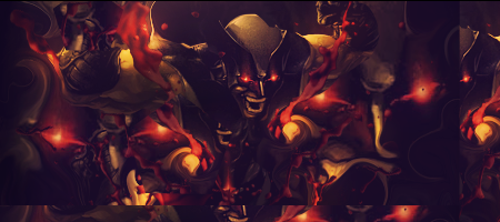
The left side of the sig is too bright.
Also I would like to see some more blending.
If you create your lightning source use the burn and dodge tool also too create right lightning on the render. Cause now the right side of zaraki looks just as bright as the left side. Burn the right side of the render
The text ould be better. Move it a bit closer to the focal point and I would also move it to a lower position.
Some effects are pretty nice
Keep at it


 Reply With Quote