Jup, I agree with BC.
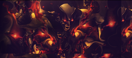
It needs more blending and better text.
The text needs to be closer to the focal point (your render)
Also I think the sig needs some more effects and better lightning.
The flow is cool and the effects you've created ar also nice
Keep at it mate


 Reply With Quote