0 members and 614 guests
No Members online

» Site Navigation

» Stats

Members: 35,442
Threads: 103,075
Posts: 826,688
Top Poster: cc.RadillacVIII (7,429)
|
-
 idk?? idk??

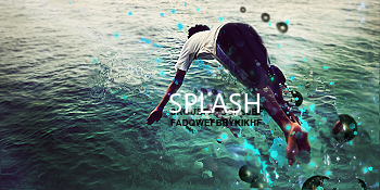
i did dis from a tut , n added a lil more to mah taste , but i dunt like how it looks, n da text is horrible but i left it on thurr :-/
-

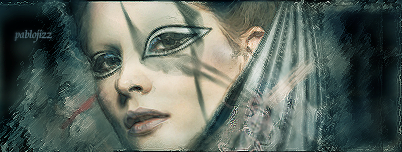
the focal is too big imo. also has not depth.
not liking the text but eh, that's the hardest part lol.
Some nice effects but seem oversharpened.
keep up the work

Challenges:
Posts: 100, 250, 500, 1,000, 2,000
SOTW Wins: 1, 2, 3
-

The focal needs to be clean. The color scheme is dull and the effects are really hard to discern. I think the texture can be improved, however try adding in some contrast to improve its appeal. Honestly speaking, I don't really like this composition. It just seems as though its a bit too much of everything and you didn't use your resources tactifully and just used whatever effect you could have. (i know its from a tut but still.) Work on color scheme and composition! Keep at it!
 Originally Posted by Slave
takken, you sweet boy you, i could eat you 6^
 Posting Permissions
- You may not post new threads
- You may not post replies
- You may not post attachments
- You may not edit your posts
-
Forum Rules
|

