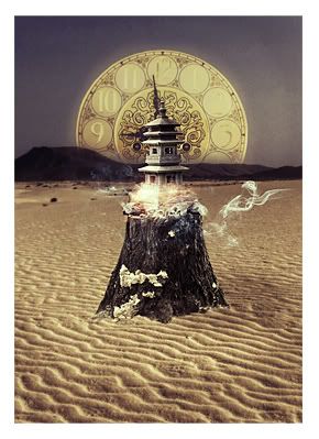
I prefer the second one.
The red comes off a little too strong in the first one.
You should also get rid of the drop shadow in the text. It never looks good on designs.
Also, because you gave the c4d (behind the subject/ render) a 3d sort of feel, the background lacks on dimension when it is put together with the c4d.
Other than that, I really like the render you used and the way its set out.


 Reply With Quote