0 members and 10,859 guests
No Members online

» Site Navigation

» Stats
Members: 35,442
Threads: 103,075
Posts: 826,688
Top Poster: cc.RadillacVIII (7,429)
|
-
-

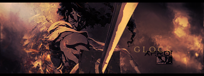
The hand seems more of a focal. I do like the tag though, its a little dark though. The effects look pretty neat. The text could use a little bit of work just because of how noticable it is. Other than that it looks pretty good.
-
Favorite and Most Recent  :

-
This is an amazing sig. It is a tad bit dark though.
-
I love this tag apart from where you've deleted a bit of the text.
also where the hand is glowing, there's a black dot in it, to me is out of place.
kiu mate.

Challenges:
Posts: 100, 250, 500, 1,000, 2,000
SOTW Wins: 1, 2, 3
-
Last edited by nasty_shinto; 07-04-2010 at 05:54 PM.
-
 Originally Posted by Nexolous

The hand seems more of a focal. I do like the tag though, its a little dark though. The effects look pretty neat. The text could use a little bit of work just because of how noticable it is. Other than that it looks pretty good.
Thanks you very much, I find it hard to make effective text, I need to work on it.
-
Text needs to go. Elements need to be more definitive but I like how you have the darkness surrounding the focal. Incorporate mroe elements around the focal. Keep at it!
Originally Posted by Slave
takken, you sweet boy you, i could eat you 6^
Similar Threads
-
By Robby89 in forum Sigs & Manips
Replies: 4
Last Post: 07-24-2008, 12:24 AM
-
By .exploited in forum Digital Art
Replies: 2
Last Post: 03-14-2006, 12:16 AM
 Posting Permissions
- You may not post new threads
- You may not post replies
- You may not post attachments
- You may not edit your posts
-
Forum Rules
|


 Reply With Quote


