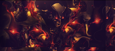
It looks like you overcontrasted the sig.
Tone it down a bit cause it kinda ruins the sig.
Also I can't see any flow... the effects are all over the place and there are too much of them.
The colors are pretty nice.
I would also remove some of the effects that are placed over the render.
Keep working at it mate


 Reply With Quote