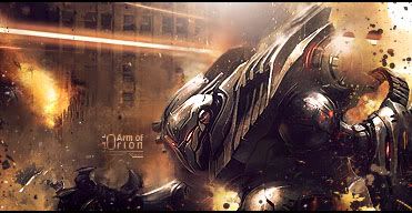
Your getting the idea, I think the text is a little too big but aside from that it's ok.
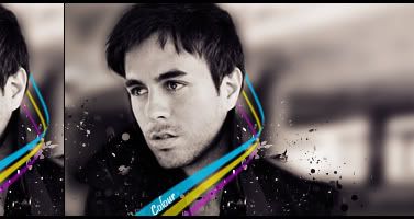
You've got the basic idea of lighting, just keep working on it. I think it should be lighter at the top middle of the sig, around his head, so it looks like there is a light source.
The works better than your other ones, the red and blue colours work with the render, though I would adjust the colours a little bit. Try playing with some gradient maps (the purple/orange one on colour or soft light with a low opacity can look really nice) but experiment with some others just remember to lower the opacity on them so they arn't so strong.
I would also suggest using the blur tool on the bottom of the render, where it starts to get darker at the bottom. Just a small amount though, that will help with the focus on the his face.
Aside from that nice progress, keep practicing and reading tuts man.


 Reply With Quote