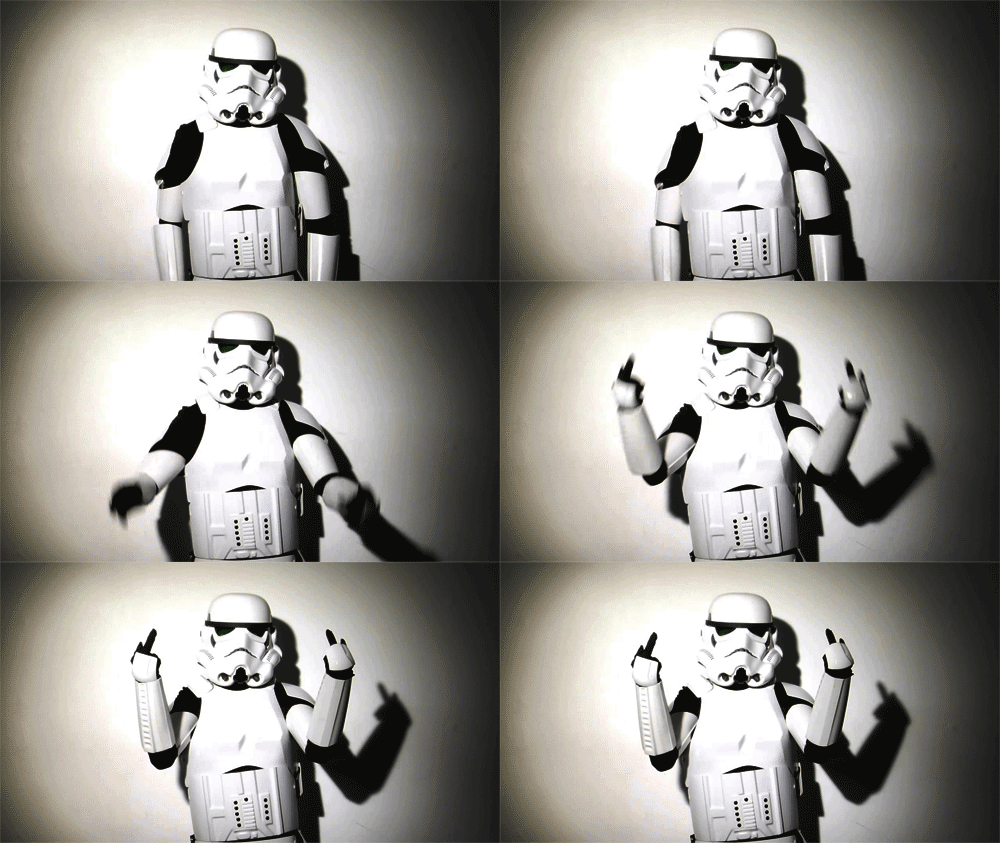
Don't put text in pieces like this. Period. Unless you do some really awesome typography to fit it in. also, its looking really flat and monotone. Adding a foreground would make sense, this just looks like a bg with no focal or point of interest. keep working, youll get there eventually.


 Reply With Quote