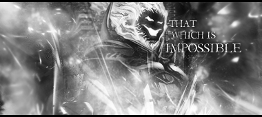
Ah, about the contrast on the render, his neck was completely shadowed in the original image. I tried to fix it once, but that ended badly. I guess the only way to fix it would have been to add contrast in the background, like Kritez said.
So for my next signature, work on focus and contrast, and spend more time with the text?


 Reply With Quote