0 members and 569 guests
No Members online

» Site Navigation

» Stats

Members: 35,442
Threads: 103,075
Posts: 826,688
Top Poster: cc.RadillacVIII (7,429)
|
-
 gurren gurren

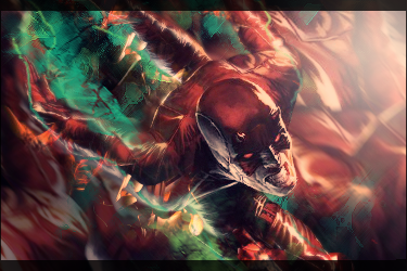
the subtext needs a bit work
-

^^^agreed bout the subtext, I would lower the opacity, also move it down, then move all the text about 10 pixels to the right, Also the font of the top text isnt workin too well, try a diff font for that text. The lighting is a little high, try moving the lighting layer down some. The borders are large, but they work ok here. The lower part of the face has some stuff on it that could probly be erased too.
-

I think you're setting yourself up to fail when using a render like that. The subtext is illegible and therefore should be removed. Only apply text if its going to help the sig, not just for the hell of it. And try not to make it parallel to the borders. People don't like some of my borders, so I wont say anything about yours, it really comes down to what YOU like. You have a solid foundation to build on.

 = Monroe Smith IV = Monroe Smith IV
 = skeetonbeezies = skeetonbeezies
-

Work on your contrast, this sig doesnt pop at all. Make it appealing to the eye. Try using simple contrast techniques involving adjustment layers and overlays
-
-

what about now ?

 Posting Permissions
- You may not post new threads
- You may not post replies
- You may not post attachments
- You may not edit your posts
-
Forum Rules
|

