0 members and 558 guests
No Members online

» Site Navigation

» Stats

Members: 35,442
Threads: 103,075
Posts: 826,688
Top Poster: cc.RadillacVIII (7,429)
|
-

The first thing I want to say is that I love the creativity on the thing you did to the right of the render (with the circles). Not sure what that technique is but it's quite inspiring to me.
I also like your choice of colors. the left background does it well.
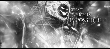
I have no idea what the text is about, but it matches the theme and color of the sig so no gripes there.
One thing I couldn't help but notice: there seems to be a light source over her shoulder, and it does harm to the already satisfactory light source above.
Also, like Monroe said, there's too much 'depth' and I think the background is blurred just a bit too much. I can sort of tell that the background represents a high-class place, therefore adding glamour to the render, but just a tad more focus couldn't hurt.
Back to the lighting, a little darkening down the bottom of the focal could do wonders, I think.
I see a lot of brown. Brown isn't a bad color, of course, but it's awfully plain.
And personally, I don't like the color of the border. Nothing on your part, just personal taste.
last thing I wanna say is that it's just a bit too radiant. A lot of bright colors and the only real contrast is light brown.
Overall I like this style, and I am looking forward to seeing more, if you enjoyed making this.
newest:
 
Similar Threads
-
By Nutter in forum Sigs & Manips
Replies: 3
Last Post: 01-24-2010, 08:24 AM
-
By ShadowEffect in forum Signature Tutorials
Replies: 5
Last Post: 11-18-2007, 04:36 PM
-
By VolantKnave in forum Digital Art
Replies: 2
Last Post: 08-22-2006, 02:26 AM
-
By Roy in forum Sigs & Manips
Replies: 4
Last Post: 06-08-2005, 10:40 AM
 Posting Permissions
- You may not post new threads
- You may not post replies
- You may not post attachments
- You may not edit your posts
-
Forum Rules
|


 Reply With Quote