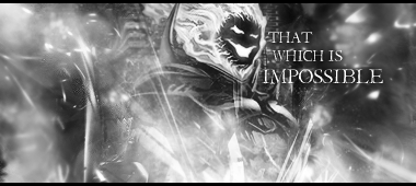
extra points for making a cartoon stock look so detailed.
Um, bit too much blank space, and the green background at the top should have a faint color glow on batman (is that batman?).
I am rather fond of what you did over his arm, especially in #2 with the lightening.
Perhaps the green on the right side is a bit too attention-grabbing? I dunno, it's a nice tone anyway.
I can tell that the light source is from about, but the render itself seems to be a little dark. I guess that's a part of being a ninja-superhero.
I've never thought of batman as someone who wears green, but this is unexpectedly good.
My favourite one is the second one, if only because it has the least blank space. Good work.


 Reply With Quote