0 members and 939 guests
No Members online

» Site Navigation

» Stats

Members: 35,442
Threads: 103,075
Posts: 826,688
Top Poster: cc.RadillacVIII (7,429)
|
-
 Latest Piece Latest Piece
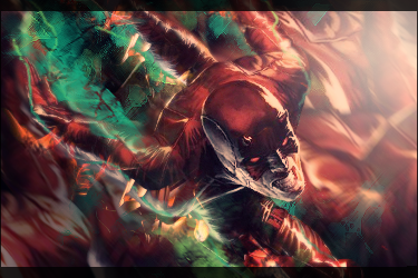
Really tried to work on the lighting and colors in this one. I was going to add more effects but I wanted it to have a clean and simple look. CnC please.


 = Monroe Smith IV = Monroe Smith IV
 = skeetonbeezies = skeetonbeezies
-

I like it, but i would say it hasnt any blending.
-

The blending is there it just needs a lil more on some edges, I like how you incorporate your name into your pieces, the text is hidden in most of your stuff which is quite interesting. Keep that goin. The flow is decent, but I would like to see some more foreground flo like something in front of him and behind to give more depth. Keep goin man, it looks pretty cool, kinda a fire and ice thing goin on too.
-

How do you got about blending without removing part of the render or brushing over it? Because its supposed to be like he's flying through the air bout to judo chop someone in the head or something, hence the motion blur. But I don't want to blend it so that part of him is disappearing into thin air. Like I said, I wanted a clean look to it, not the usual abstract/grunge style thats popular. Which is why I was trying to blend it purely off the colors and lighting, which Im sure isnt perfect. Any tips on that specifically?

 = Monroe Smith IV = Monroe Smith IV
 = skeetonbeezies = skeetonbeezies
-

You could duplicate the render a few times, with the layers behind the top render layer you smudge the edges, or gaussian blur it to like 5px, motion blur in your flow direction, erasing areas that look bad. So that the edges blend in and dont look cut and pasted. I would also suggest using a eraser brush with like a 95% hardness, 100% opacity and go to the top render layer, zoom in to the edges and make some adjustments as needed on hard cut lines, or sharp edges to smooth the transition from render to bg. You could also cover edges with effects or smudge them with a small smudge brush bout 30 px brush circular brush setting.
-
-

you need more of the motion blur on the render and in the BG. if someones flyin at you at that pace you would expect most of the blur to fill the BG. i would do like Domino says. i remember there was a gambit tutorial in one of the resource packs that had the same exact style. with the motion blue and lightin. im not sure which one it is though
-

I like the way it flows you get a good sense of movement but the thing that is bugging me is the blue on the left i would of just kept the orange going on the upper right
Text is good as always
And this is also alot cleaner than your oter work which i much prefer
Keep it up broseph
thanks naruto <3


 Originally Posted by littlefeet

they say until it happens they wont believe it, but if it ever does happen, they'll say it didn't actually happen. So it can actually never happen to them, even if it does happen to them
<< LOL
-

I agree with what domino said. Also work on your composition. It seems like there is to much going on and its hard to JUST focus on your focal point. I would suggest some blurring of your background.
Also work on your effects. For this tag i dont see any effects other than a motion blur and your lighting. So if you tone down the BG sharpness, and add some effects to your focal i think you could increase the tag quite a bit.
Goodwork, kiu
-

I took all of your guys' criticisms into considerations and this is what I came up:
V2

compared to the old one:


 = Monroe Smith IV = Monroe Smith IV
 = skeetonbeezies = skeetonbeezies
Similar Threads
-
By ZonariAn in forum Digital Art
Replies: 7
Last Post: 04-25-2010, 02:17 PM
-
By Scrib in forum Digital Art
Replies: 11
Last Post: 10-27-2009, 01:08 PM
-
By hpsnagra in forum Digital Art
Replies: 2
Last Post: 05-24-2006, 03:12 PM
-
By SJS91 in forum Digital Art
Replies: 8
Last Post: 01-29-2006, 04:03 PM
-
By Roy in forum Digital Art
Replies: 0
Last Post: 03-31-2005, 11:14 AM
 Posting Permissions
- You may not post new threads
- You may not post replies
- You may not post attachments
- You may not edit your posts
-
Forum Rules
|


