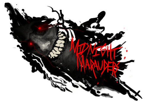
I like what youve done with the smudge effects here, very good job. My biggest complain is the composition and the color.
For something like this, your going to want a larger size sig, give yourself alittle more space to put that stock in and work with it.
You have a bright smudge spot on the right side of your sig... that spot takes away from your focal point... it draws the viewers eye away from your center stock (the dark knight itself). I would suggest keeping something similar to that smudge the same, but moving it under or closer to your stock.
For the colors... stick with what the stock gives you (Black, Blue, Cobalt, Grey). Simple as that.
Other than that i think you did a good job, kiu


 Reply With Quote