0 members and 7,087 guests
No Members online

» Site Navigation

» Stats
Members: 35,442
Threads: 103,075
Posts: 826,688
Top Poster: cc.RadillacVIII (7,429)
|
-
08-27-2010, 12:11 PM
#4031

2/10. It all looks low quality, and there is not a focal point.
-
08-27-2010, 01:38 PM
#4032
text could use work, otherwise i like the lighting blending and effects in the 2nd one, nice smudging in the first 7/10 overall 
Old but most recent.
 Originally Posted by Tyler Durden
Sticking feathers up your butt does not make you a chicken.
-
08-27-2010, 02:06 PM
#4033
Trash complete trash lol jk
1. 7/10 I like the smudge effects but the text is wierd and seems out of place. other than that its awesome.
2. 6/10 Very smooth feeling to it text is a bit eh and there seems to be alot of empty space the left

My Three Rules Of Making a Sig Flow, Lighting and Depth
-
08-27-2010, 02:23 PM
#4034
7/10
I like the fact that the flowers are comming from the hair.
it kinda looks like the hair transforms into flowers 
You've created pretty good lightning. I don't really like the border
6/10
It looks a bit lq. I like the C4D efects at her shoulder.
the smudging is also pretty nice. The lightning looks a bit weird.
If I were you I would place the lightning source a bit closer to the focal
-
08-27-2010, 04:03 PM
#4035
8/10
The colors, blending, text, and effects are all on point. Great sig.

 = Monroe Smith IV = Monroe Smith IV
 = skeetonbeezies = skeetonbeezies
-
08-27-2010, 04:11 PM
#4036
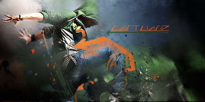
4/10. I love the colors and the depth but the motion blur kills it for me.
-
08-28-2010, 10:41 PM
#4037
8/10 I like your pull back from the render, I find it hard to smudge  +1 for talent +1 for talent
You lost points with me cause of the colours >.<
 Radi's one of a kind gift <3
 ^My Wish List^

-
08-29-2010, 01:46 AM
#4038
3.5/10.
There's a little too much going on and there's no real depth or light source. The text isn't to good either. I'm not a fan of tiny sigs.
-
08-29-2010, 03:07 PM
#4039
7/10 nice smudge bg but some parts of the render is wrongly smudge IMO anyway KIU
Favorite and Most Recent :

-
08-29-2010, 03:11 PM
#4040
5.5/10, i'm not very sure about this tag
Similar Threads
-
By SgtSwabs in forum The Void
Replies: 16
Last Post: 12-06-2005, 08:42 PM
-
By LunarPoet in forum Sigs & Manips
Replies: 1
Last Post: 06-23-2005, 12:31 PM
-
By Xavier in forum Sigs & Manips
Replies: 8
Last Post: 06-03-2005, 01:46 AM
 Posting Permissions
- You may not post new threads
- You may not post replies
- You may not post attachments
- You may not edit your posts
-
Forum Rules
|


 Reply With Quote