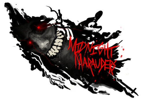
Im not to fond of the first. I think the render is to big for the size of the sig. But the colors and effects are fine.
The second one is much better. I like the placement of the sig. the effects are good but could be a bit smoother (some filters, smudging or topaz clean could help smooth it out).
The lighting on the left of the sig doesnt look natural, but you have placed it correctly. To work with that natural feel try doing an adjustment layer, gradient map, b/w. Set it to luminosity. Erase overdone parts (not the lighting though).
good work man, kiu


 Reply With Quote