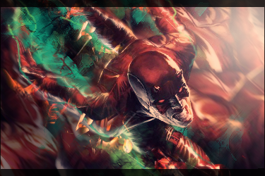
I would brighten up the whole sig so its similar to your current ones (as far as the brightness of colors, not the styles) because it seems like a really colorful sig, yet it seems like it really lacks color. It looks like it was hella sick, then you applied the image and set it to multiply to get this. But yeah, as far as the style and all, I like it, just need to make those colors more vibrant and give it some life.


 Reply With Quote