0 members and 17,360 guests
No Members online

» Site Navigation

» Stats
Members: 35,442
Threads: 103,075
Posts: 826,688
Top Poster: cc.RadillacVIII (7,429)
|
-
 Big Daddy Big Daddy
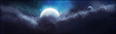
The is a new style I tried. I'm not sure if it looks good, Tell me what you think.

C&C
SOTW Trophies/KOTH Champion Crown:
[ X] [ X]
-
bioshock ftw!
-
The lighting is ok, but it is kinda of blended to much if you know what i mean
It is hard to tell what that even is. I think it is a well done signature, just a little confusing.
-
Yea bioshock ftw :P
Yea Ik what you mean that its kinda hard to tell but what I mainly tried doing in the signature is try out new effects. Hows the blueish ocean water and the Effects over its "Eyes".
Thanks :]
Last edited by Agato; 09-06-2010 at 09:30 PM.
Reason: Changed Flames to Water :P
SOTW Trophies/KOTH Champion Crown:
[ X] [ X]
-
lighting is a tad bit strong but i love the effects man really good job and i can see your style in this tag kiu man
ps those are flames ahha i thought was water made it like an oil base painting where he popping up from the ocean ? what it looks like too me
-
 Originally Posted by sirenzo

lighting is a tad bit strong but i love the effects man really good job and i can see your style in this tag kiu man
ps those are flames ahha i thought was water made it like an oil base painting where he popping up from the ocean ? what it looks like too me
Thanks, yea I try to add a bit to much lighting.
Tbh I wasn't really trying to add flames, I just started messing around with the settings and it turned out like that so the first thing I thought was flames xD
but that water effect actually sounds a lot better :]
Thanks
SOTW Trophies/KOTH Champion Crown:
[ X] [ X]
-
It's not bad, the lighting in the top right feels really off. Seems kind of flat on the left side. You've got a real opportunity for some depth there.


SOMETIMES I LIKE TO CREATE THINGS
-
nice i like it , but seems the color on th focal doesnt match that much with the c4d(u made the technique of cs4pro right?:P) and the right top corner.if the right top corner is your light source, then i believe its wrong as it should be on the left of the render.
But we're the ones who kill our neighbors,
To stay safe and sound
-
Thanks everyone
Yea the light source is flat and not going with it but I tried making it go around because behind the render it haves a glare so tried doing something.
and Yea I did use cs4pro technique in here.
I', gonna use that style in my next signatures with some other things added.
At first the yellow c4d around its "Eyes" gonna be behind him but I wanted to try some new things.
SOTW Trophies/KOTH Champion Crown:
[ X] [ X]
-
I like this effect in the left corner reaching out to the render, as said above the light seems too much for this sig but it is lookin pretty jawsome
Never hurts to try new things <3
KIU
 Radi's one of a kind gift <3
 ^My Wish List^

Similar Threads
-
By crozer in forum Digital Art
Replies: 6
Last Post: 09-26-2009, 12:54 AM
-
By Reinkaos in forum Sigs & Manips
Replies: 1
Last Post: 07-31-2008, 10:08 AM
-
By Firescorpio in forum Sigs & Manips
Replies: 13
Last Post: 06-24-2008, 08:40 PM
-
By graffic in forum Sigs & Manips
Replies: 8
Last Post: 08-26-2005, 01:57 AM
 Posting Permissions
- You may not post new threads
- You may not post replies
- You may not post attachments
- You may not edit your posts
-
Forum Rules
|


 Reply With Quote