0 members and 539 guests
No Members online

» Site Navigation

» Stats

Members: 35,442
Threads: 103,075
Posts: 826,688
Top Poster: cc.RadillacVIII (7,429)
|
-
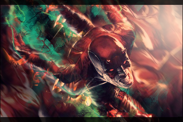
 Abstract vector Abstract vector

Doing some new vector stuff :)
Let me know what you guys think!
Thanks! x
-

very nice! good 3D. is it me or is it not vertical? it's a bit empty, so i say go on and add some extra of this nice stuff.
From scratch, just smudging the XL way
-
-

I think it barely vector, and definitely not abstract. I don't know, maybe I was just giving you too much credit, but I expected something totally well...abstract and vector...and when I saw this I was disappointed. Not that's it bad, but it's definitely novice. It's very random, serves no purpose in other words. It's not a logo, it doesn't convey an idea, it not a recognizable image, nothing. Just some random shape. That looks rather easy to make now that I look at it. I'm sure you haven't made something like this before, so keep experimenting because that's always good. But this is shit. Not bad shit. But the type of shit you put in the Scraps section or your DevArt profile. You know what I mean? No disrespect though,

 = Monroe Smith IV = Monroe Smith IV
 = skeetonbeezies = skeetonbeezies
-

Well give it a better name then. I don't know what it looks like so I just chose abstact. And yes, it was simple and easy but I was also just experimenting. Also, I'm pretty new to this all and I put things on here for constructive criticism. I don't need to hear that it's random and doesn't fit with the name. These are things I already now! I need to hear things like: More details (what and where) and people telling me that the background could use some lighting. Yeah no "disrespect" but your comment doesn't give me anything BUT discouragement. I've been using PS for what? 2 active weeks? I don't need you telling me that this is (not bad) shit. I know I can do better and hell! I feel bad for posting shit like this on the forum while it's mixed in with a lot of better pieces. So man, be more helpful instead of stating the obvious.
-

Colors need work. I've always loved vectors to be really brightly, and vibrantly colored. Not to say I haven't seen dark ones, but this is some sort of washed out purple and yellow, that really are not appealing at all.
You need to develope your concept better, the shapes are random and don't seem to really mean anything, and if they do, it's way too minimalistic for me. The shadows are nice, makes it feel like it's being etched into the canvas, however, the bevels on the opposite end feel awkward, and don't actually look three dimensional, so much as they do kind of cheap and tacky (especially because layers styles always leave the edges of the canvas gross, and canvased in instead of cropped off) An easy way around that is to make it at the full size you want it, hide all your layers but the ones you want to be of that layer style, and then go to layers > merge all visible (or is it flatten all visible? I'm not sure, I don't have PS open currently.
Other than that, it's good to learn new techniques, but I'd definitely just move on to a new piece instead of trying to fix this one, you'd be better off taking what you learned from this, and applying it to something new, rather than just tweaking this.


SOMETIMES I LIKE TO CREATE THINGS
-

Well i agree that monroe was out of order there. You can't say that people are shit then say no disrespect. And why should a piece have to have a purpose? This is gonna be sold. It isn't for anyone else but myeline. So tone down the critism and be a little more helpful.
Anyways i don't think this piece looks finished. It isn't too bad though. I think you should change the colours and add some textures on the background.
If this was my piece i think i would turn the shape horizontal and split the screen. And maybe add 2 images on each side. I dunno. keep working on it.
Keep it up.
-
-

I was drunk and out of line. I apologize. I still stand behind what I said but I could have found nicer ways to say it.
You should work on color schemes because while the colors don't necessarily clash, they don't benefit one another either. I would also remove the inner shadow for more of a vector look.

 = Monroe Smith IV = Monroe Smith IV
 = skeetonbeezies = skeetonbeezies
-

I seriously couldn't care less about what you think of my piece. Don't go posting offensive shit on forums while drunk.
Similar Threads
-
By Grumpylump in forum Sigs & Manips
Replies: 5
Last Post: 04-07-2008, 08:55 AM
-
By ShadowEffect in forum Signature Tutorials
Replies: 5
Last Post: 11-18-2007, 04:36 PM
-
By Henry in forum Digital Art
Replies: 20
Last Post: 07-04-2006, 02:46 PM
-
By ROTD in forum Sigs & Manips
Replies: 7
Last Post: 06-07-2005, 12:59 PM
Tags for this Thread
 Posting Permissions
- You may not post new threads
- You may not post replies
- You may not post attachments
- You may not edit your posts
-
Forum Rules
|

