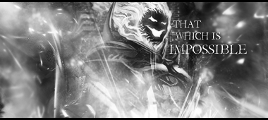
I think the signature in general is a bit too bright and the effects look faded in rather than blended.
I'd also say the text needs a li'l something. Have you tried blue?
As a general rule, the edges should be darker than the focal, unless they're supposed to attract attention.


 Reply With Quote