0 members and 806 guests
No Members online

» Site Navigation

» Stats
Members: 35,442
Threads: 103,075
Posts: 826,688
Top Poster: cc.RadillacVIII (7,429)
|
-
10-26-2010, 11:07 PM
#4151

6.5/10.
Not bad considering it's simplicity!
-
10-29-2010, 11:46 AM
#4152
4.5/10
I don't really like. It seems you limited yourself to the amount of media you are able to use.
Also, I just don't feel the fractal colors really work.
-
10-29-2010, 12:26 PM
#4153
4.5/5
the font you wrote Joey with just doesn't fit there man.
.::SWAG::.

-
10-29-2010, 12:29 PM
#4154
5/10 the sig has no flow and the effects are covering the focal
-
10-29-2010, 07:14 PM
#4155
8/10
nc use of c4ds,not sure about the lighting..
-
10-29-2010, 07:18 PM
#4156
1st - 7.5/10
2nd - 6.5/10
I already posted why on your other thread ^^.
-
10-29-2010, 08:17 PM
#4157
4/10. The topaz kills it for me.
8/10. The topaz is a little more forgiving here but still over done.
I'm sure you've heard it before, but the use of topaz really eliminates the depth and detail that you should have in your sigs.
-
10-29-2010, 10:10 PM
#4158
5/10
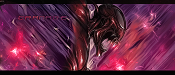
Pretty good just a bit of an over kill with the fractal, Still love it though cause of Spidey :P
-
10-29-2010, 10:57 PM
#4159
5/10 Ehh just a different perspective background and then a render being popped out of the sig. Not really doing it for me.

My Three Rules Of Making a Sig Flow, Lighting and Depth
-
10-30-2010, 12:34 AM
#4160
 Originally Posted by RunningMan

4/10. The topaz kills it for me.
8/10. The topaz is a little more forgiving here but still over done.
I'm sure you've heard it before, but the use of topaz really eliminates the depth and detail that you should have in your sigs.
Dude, that doesn't make any sense. I used more topaz in the second one.
The first one was a low strength topaz on 67%.
The second one was left at 100%.
@DR
8.5/10
Lighting needs work and the C4D is a bit too big, but really nice otherwise.
7/10
Not digging the text, major downfall for me.
Similar Threads
-
By SgtSwabs in forum The Void
Replies: 16
Last Post: 12-06-2005, 08:42 PM
-
By LunarPoet in forum Sigs & Manips
Replies: 1
Last Post: 06-23-2005, 12:31 PM
-
By Xavier in forum Sigs & Manips
Replies: 8
Last Post: 06-03-2005, 01:46 AM
 Posting Permissions
- You may not post new threads
- You may not post replies
- You may not post attachments
- You may not edit your posts
-
Forum Rules
|


 Reply With Quote