


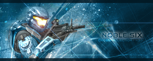
I think the border colour needs to be a bit more solid in my opinion. It just looks odd how it's partially see-through. The diagonal line through the visor also breaks the sig up a bit. It draws attention away from the focal area. The other thing is you've spaced it out quite a fair way. On one side you have the soldier, on the other your text. Try in future to bring them closer so the viewer doesn't have to shift their vision from one side to the other.Originally Posted by Cross Projection

Really, it's just a few placement things and some minor details, other then that I think it's pretty good. Background effects somewhat suit the character, colours are smooth and it's pretty clean.
Nice work Nads.


 Reply With Quote