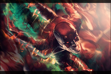
Not bad at all. I like the background for it. I would work on your blending though. Don't just rely on erasing the edges to blend it, because when I look at the sig that seems to be it's major downfall. She's doesn't look blended in, she just looks partially erased, if that makes sense. I would also work on your coloring, try not to make half of the skin pure white, and the shadows shade of red/orange. Try to enhance the color while preserving the skin's natural color.


 Reply With Quote