GFXVoid Graphic Design Forum

Remove Text Formatting
Loading...

» Online Users: 4,693

0 members and 4,693 guests
No Members online

» Site Navigation

 > FAQ

» Stats

Members: 35,442
Threads: 103,075
Posts: 826,688
Top Poster: cc.RadillacVIII (7,429)
Welcome to our newest member, Lekelindids
Results 1 to 9 of 9

Thread: Akuma TFF

  1. #1
    Join Date
    Jul 2010
    Posts
    81

    Default Akuma TFF


  2. #2
    Join Date
    Dec 2009
    Location
    Netherlands
    Posts
    1,412

  3. #3
    Join Date
    Aug 2009
    Posts
    345

    Default

    you need to find better effects than random brush sets


  4. #4
    Join Date
    Mar 2007
    Location
    Denmark
    Posts
    4,197

    Default

    Quote Originally Posted by (-)Ion View Post
    you need to find better effects than random brush sets
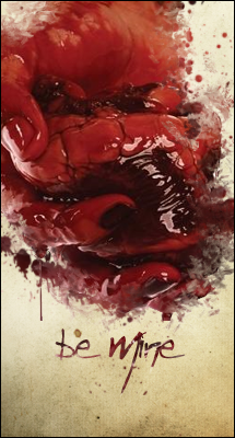
    I could not agree less here, the brushes haven't been overdone and the coulor scheme he/she used with it just fit perfekt. I think it is very nice that you took a cutout of a anime/cartoon and ended up with this, normally it ends up in a huge signature lookalike, but i think you managed to keep it simple and really create a composition and a nice atmosphere. nice job m8


  5. #5
    Join Date
    Nov 2010
    Posts
    301

    Default

    This peace is perfect the way it is..nothing is overused and it flows great. Its inpiring me to make a anime large art, and you know you did a great job when you inspire people to rush back to photoshop to work on something.

  6. #6
    Join Date
    Sep 2009
    Location
    New Jersey
    Posts
    4,752

    Default

    This piece is awesome man. I love it.


  7. #7
    Join Date
    Sep 2009
    Location
    Sweden
    Posts
    727

    Default

    Its an awesome piece no doubt but im not really sure about the focal point. My eyes are drawn to his backside and arms not his face which i think is the intended focal but i could be wrong.
    It's always in dark caves!
    Heroes aren't borne, they are cornered!
    Thx UnDeRoAtH


  8. #8
    Join Date
    Sep 2008
    Posts
    1,589

    Default

    Sick stuff this.

    I think the brush work and placement is top stuff. It is realy helping the light source stand out well.

    I agree with Dae totaly.

  9. #9
    Join Date
    May 2008
    Location
    Michigan
    Posts
    1,227

    Default

    I digg it, but I don't like the text. You should have kept it up with red and black. The orange is at tad random.

Similar Threads

  1. Akuma
    By Reyn in forum Sigs & Manips
    Replies: 1
    Last Post: 10-03-2010, 01:57 AM
  2. [WIP] Akuma
    By tekken in forum Sigs & Manips
    Replies: 10
    Last Post: 05-03-2009, 08:03 PM
  3. Akuma
    By DeadlyShadow in forum Sigs & Manips
    Replies: 7
    Last Post: 07-14-2008, 10:46 AM
  4. Akuma
    By Eigelchen in forum Digital Art
    Replies: 2
    Last Post: 08-01-2006, 09:46 AM
  5. akuma?
    By Heart in forum Digital Art
    Replies: 1
    Last Post: 03-15-2006, 12:18 PM

Posting Permissions

  • You may not post new threads
  • You may not post replies
  • You may not post attachments
  • You may not edit your posts
  •  
Powered by vBadvanced CMPS v4.1.1