0 members and 3,595 guests
No Members online

» Site Navigation

» Stats
Members: 35,442
Threads: 103,075
Posts: 826,688
Top Poster: cc.RadillacVIII (7,429)
|
-
 fallout new vegas fallout new vegas
-
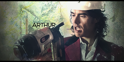
Hahaa as my torrent finishes... Lookin good, the only thing I dislike is the particle fx, maybe blur em up a bit especially on the character
-
 Originally Posted by Nitsuj

Hahaa as my torrent finishes... Lookin good, the only thing I dislike is the particle fx, maybe blur em up a bit especially on the character
thanks, im going to do that right now
-
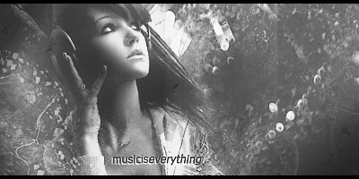
was this a stock? if not, i think the bg could be better, maybe add texts and stuff to make it more appealing. I kinda like the feel of it cuz of the particles but it kinda bugs me either cuz its too much. Colors need a little bot of work, the contrast is soooo strong bruhh, i dont quite like that :P
lighting is also way off, i mean, there ain't no light source. it really looks plain and undone, add some more tweaks to it 
harharhar
I dont make sigs anymore
-
Game is awesome btw, until I hit alt+tab to check my facebook and it froze =(
-
i like it and i think i need get this game soon lol
-
epic
love the feel to it
especiaally like the lighting
i would say you should erase some of the effects from the focal imo
but GJ
-
vn bogui kiu man good lighting depth and blending
-
-
sadly all I really see are topaz artifacts across the entire canvas. it's unappealing when you do that.
Similar Threads
-
By Roy in forum Resources
Replies: 3
Last Post: 06-06-2008, 02:39 PM
-
By II T A C O II in forum Sigs & Manips
Replies: 7
Last Post: 04-06-2008, 01:52 AM
-
By ~FireTap in forum Sigs & Manips
Replies: 8
Last Post: 02-20-2008, 07:02 AM
-
By Kelso in forum Resources
Replies: 8
Last Post: 05-18-2007, 01:03 PM
-
By Godhand in forum Digital Art
Replies: 0
Last Post: 10-26-2005, 05:33 PM
 Posting Permissions
- You may not post new threads
- You may not post replies
- You may not post attachments
- You may not edit your posts
-
Forum Rules
|


 Reply With Quote