0 members and 26,370 guests
No Members online

» Site Navigation

» Stats
Members: 35,442
Threads: 103,075
Posts: 826,688
Top Poster: cc.RadillacVIII (7,429)
|
-
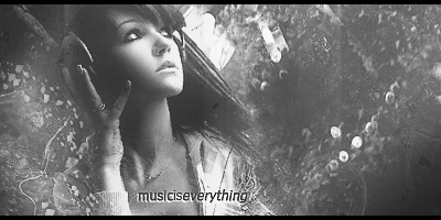
 Quiet. Quiet.

Just something random I threw together.
-
Thrown together things never look good. That 1 c4d doesnt fit, and the text is blah. Idek know what Im lookin at?
-
Yeah that's exactly what it is...random.
The text would look cool as spray paint on the walls or something.
And the c4d really doesn't fit...maybe some spark effects could work with it, since it looks like those film wheels were demolished.
It just has no real unified theme to it so I'm not really sure what to think xD
-
The text sucks my love. It is also lacking a focal point IMO. I think if you had something to focus on this would be better, but when your eye just wanders it kills the piece. I kind of have to agree with the C4D. IMO C4D's don't look all that well in large art, but thats just mean and you are just a sig noob. I keed I keed. Its not too bad, but kind of bleh overall.
-
Yeah, I don't really care for text, but everyone QQ rages when you don't place text into your art. And I really wasn't going for a theme here, I just figured art was about expressing yourself and the way people interpret things, I just wanted to see if someone was creavite and could come up with a theme kind of thing. Idk I'm kind of in a slump creativity wise. D=
Thanks for the CnC<3
-
but everyone QQ rages when you don't place text into your art.
I wouldn't understand why, it isn't a necessisity and it usally is auto-distracting from your focal point.
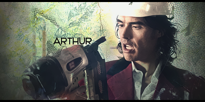
Anyways, as for the piece itself.
Well, I personally think you can improve it.
I dislike the effects and the effect color.
It doesn't suit the atmosphere, imo.
Looking at the stock or whatever you've used, I would try a bit grungy type of style.
Or, you can keep it clean and try to only emphasize lighting.
(Burning, Dodging, Lighting Effects, Curves)
The text does need work, it feels too randomly placed and I don't really like the font.
Also, the stock you used looks low quality.
I'm guessing it's only the stock because your effect quality looks fine.
Should've sharpened that up a bit  ! !
Keep it up !
Similar Threads
-
By Reinkaos in forum Digital Art
Replies: 0
Last Post: 01-10-2010, 08:11 PM
-
By DeadlyShadow in forum Sigs & Manips
Replies: 3
Last Post: 01-06-2009, 09:45 PM
-
By Neiromaru in forum Sigs & Manips
Replies: 1
Last Post: 01-31-2006, 08:23 PM
 Posting Permissions
- You may not post new threads
- You may not post replies
- You may not post attachments
- You may not edit your posts
-
Forum Rules
|


 Reply With Quote


 Thanks JDragon <3


