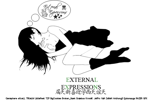
Great Sig Nice Use of your graphics and brushes
i think you could possible use a little more shading but it doesn't effect it too much
i would of liked to have seen a crossover in the text of red vs green as well but im still deciding if it would of been over the top and focused too much on your text or if it would of just been a bad idea
Great Work look forward to seeing more from you.


 Reply With Quote