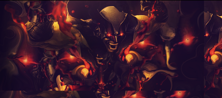
The main problem here is that the text is centered and the head of the hulk (the focal) is placed somewhere near a corner of the sig. This means that my first look goes to the text and not to the, what used to be, the focal point. So you ahve to place the text and the focal point somewhere else.
The "Hulk" text is nice but the "Draghen" text isn't in my opinion.
You can better change the font into a nice unnoted (or h/e you call it) font.
The lightning you've created is pretty nice, a bit too bright tho. But you have to create more lightning around your lgithning source. Don't make it brighter tho.
I like the splatter effects and the flow is good
This tag could use some gradients to make the red and green match better.
Keep working at it mate, you're doing good
KIU


