GFXVoid Graphic Design Forum

Remove Text Formatting
Loading...

» Online Users: 679

0 members and 679 guests
No Members online

» Site Navigation

 > FAQ

» Stats

Members: 35,442
Threads: 103,075
Posts: 826,688
Top Poster: cc.RadillacVIII (7,429)
Welcome to our newest member, Lekelindids
Results 1 to 5 of 5

Thread: Wombo Combo

  1. #1
    Join Date
    Dec 2010
    Location
    italy
    Posts
    287

    Default Wombo Combo


  2. #2
    Join Date
    Dec 2010
    Location
    Toronto, Canada
    Posts
    325

    Default

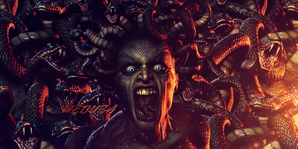
    Good flow and decent text but I feel like the sig itself has a little bit too much width and that the colours don't really blend well with the renders

    KIU ^_^


  3. #3
    Join Date
    Dec 2010
    Posts
    496

    Default

    that aint falco

    but yea gradients might help with blending

  4. #4
    Join Date
    Dec 2010
    Location
    italy
    Posts
    287

    Default

    thanks for the advice.
    I tried with different colors

    WOMBO COMBO!!!!! v2

  5. #5
    Join Date
    Jul 2009
    Location
    Brooklyn, New York
    Posts
    1,604

    Default

    Umm the text and lighting is off. Flow is alright but its seems eh imo.
    Your focal is weird maybe making it longer and decreasing the width will help.
    keep at it

    My Three Rules Of Making a Sig Flow, Lighting and Depth


Similar Threads

  1. Sig and Avatar Combo
    By Etitan in forum Sigs & Manips
    Replies: 3
    Last Post: 07-04-2006, 02:39 PM
  2. my first tech combo with first popout
    By natso in forum Sigs & Manips
    Replies: 15
    Last Post: 07-25-2005, 04:59 PM

Posting Permissions

  • You may not post new threads
  • You may not post replies
  • You may not post attachments
  • You may not edit your posts
  •  
Powered by vBadvanced CMPS v4.1.1