0 members and 4,951 guests
No Members online

» Site Navigation

» Stats
Members: 35,442
Threads: 103,075
Posts: 826,688
Top Poster: cc.RadillacVIII (7,429)
|
-
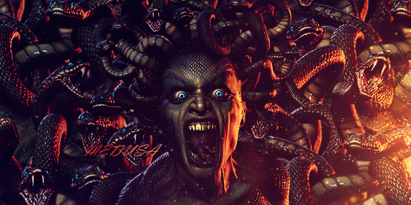
 Uncharted 3 Sig Uncharted 3 Sig

CnC is appreciated.
-
the left duplicate is not needed. effects, feel and flow looks good mate. nicely done. just a bit more contrast is needed, adjustment layers mate, play w/ em 
-
Wow, great effects. i think the thing you did on the left wasn't a good add, i would just recommend making the width smaller, the text is good but not very good placement maybe just moving it closer to the render.
Good job, i love this.
-
-
I actually like the duplicate effect, and the flames look great.
-
actually there are 3 adj layers, which i think third one made me loose the contrast but gave a cool tone. thanks for the input, will be fixing some stuff up.
[edit] wow three replies before i even got a chance to post this reply lol. thanks guys. i will remove the repeat,just thought the flames parts connected well. i would also like to know what you think about border and that lens flare. thanks guys
Last edited by notthefed; 01-01-2011 at 11:25 PM.
-
great depth, great feel
I love it!
keep it up bro
P.S this time you were able to write your name correctly, good job!
Last edited by Timentia; 01-02-2011 at 04:28 AM.
-
-
-
i agree with emse, the dublicate in left is not needed, other ways i have nothing to say, except that this is one awesome sigg
Similar Threads
-
By Whisky in forum Sigs & Manips
Replies: 0
Last Post: 12-19-2009, 02:59 PM
-
By jorrne in forum Sigs & Manips
Replies: 4
Last Post: 01-18-2009, 09:37 AM
-
By ratchetnclank in forum Sigs & Manips
Replies: 2
Last Post: 02-09-2008, 05:37 PM
 Posting Permissions
- You may not post new threads
- You may not post replies
- You may not post attachments
- You may not edit your posts
-
Forum Rules
|


 Reply With Quote