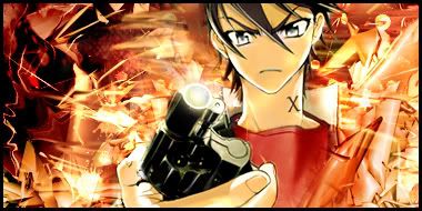
GFXVoid Graphic Design Forum

Remove Text Formatting
Loading...

» Online Users: 3,410

0 members and 3,410 guests
No Members online

» Site Navigation

 > FAQ

» Stats

Members: 35,442
Threads: 103,075
Posts: 826,688
Top Poster: cc.RadillacVIII (7,429)
Welcome to our newest member, Lekelindids
Results 1 to 6 of 6
  1. #1
    Join Date
    Dec 2010
    Location
    Buffalo New York
    Posts
    127

    Default Star Wars 2nd start


    V2


    its not done yet, i need opinons.. i like the right side but i was thinking about redoing the left side bg... text isNT final yet this is not done,

    Its looking alot better than the other one lol!! :-D
    Last edited by eXcell; 01-02-2011 at 01:42 AM. Reason: typo

  2. #2
    Join Date
    Dec 2010
    Posts
    135

    Default

    BG is nice and text is decent. i think you should work on blending the render and that one stock behind the trooper (c4d?) more into BG. maybe smudge or add some c4d up front. u can use hue/sat (cnrl+u) to manipulate colors which aids in blending. also you can blur BG bit to bring out the render more.
    also that green radiant on the render, i think it should be erased on the black parts.
    just few suggestions. KIU

  3. #3
    Join Date
    Jul 2008
    Location
    Leominster, Massachusettes
    Posts
    2,293

    Default

    The render looks a bit low quality. I'm not a fan of the C4D behind the render it's not very well blended and it doesn't really fit in. Depth could use a few tweaks along with the lighting. Sharpen the render a bit and throw in some gradient maps and filters for blending.

  4. #4
    Join Date
    Dec 2010
    Location
    Manila, Philippines
    Posts
    306

    Default

    Blending needs work, toning looks good. lightning is a bit off. works needs work also. C4d work and flow looks decent KIU mate

  5. #5
    Join Date
    Dec 2010
    Location
    Buffalo New York
    Posts
    127

    Default

    i added V2, i took that C4 that was behing the render and made it look like its wrapped around his arm an goes behind his head, does that look better??


    Im still looking for a font on dafont.com any ideas im open for suggestions

  6. #6
    Join Date
    Dec 2010
    Location
    Buffalo New York
    Posts
    127

    Default

    Final version


    Thank you guys for all the tips, this is prob my fav one ive made

Similar Threads

  1. Star Wars Sig.
    By Cap'n Jazz in forum Sigs & Manips
    Replies: 6
    Last Post: 07-04-2010, 12:27 PM
  2. Star Wars tag.
    By Tryne in forum Sigs & Manips
    Replies: 1
    Last Post: 01-24-2010, 10:07 AM
  3. Star Wars
    By Undertaker in forum Digital Art
    Replies: 3
    Last Post: 08-16-2005, 09:40 PM
  4. star wars sig
    By keewee in forum Sigs & Manips
    Replies: 4
    Last Post: 06-20-2005, 05:33 AM
  5. star wars sig
    By IndoSilver in forum Sigs & Manips
    Replies: 6
    Last Post: 06-13-2005, 09:23 AM

Posting Permissions

  • You may not post new threads
  • You may not post replies
  • You may not post attachments
  • You may not edit your posts
  •  
Powered by vBadvanced CMPS v4.1.1