0 members and 1,912 guests
No Members online

» Site Navigation

» Stats
Members: 35,442
Threads: 103,075
Posts: 826,688
Top Poster: cc.RadillacVIII (7,429)
|
-
 Oyama Oyama
CnC please
-
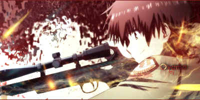
good composition of the render, the lighting over the face is a bit bright, reduce it a little and darken the bg behind the gun to bring its focal point out a lil more. Keep it up, the text is also hard to see, try new placement or different font.
-
-
this is so good!!
good light source, good focal, colors match perfectly, you made the ocean ripple totally match it, the face of the render nicely kept its colors! the sniper is nicely cut out, nothing near choppy!
keep it up man!
-
 Originally Posted by van Zeben

i dont like anything about this. No flow or light source. The background is odd, same goes for the c4d and the face is too bright, and the gun looks out of place (not your fault its the render) and you can barely see the text
Try using some different effects and use multiple colours from the render to create the bg if you want a simple one. also the C4d doesnt fit with it and youve attempted to incorporate it where it should be, apply a gradient mask to it and move it up into the hair to add some texture, or just remove it completely.
For the light source you can a) brush individually the dark a light areas (layer set to overlay white and black soft brush) or you can use lighting effects. As for the flow the sig doesent go anywhere is just sitting there, give it a sense of movement
Move your text into a different area or change the font/remove the drop shadow
seriously? are you blind? what do you want? a solid white color? the lighting comes from the end of the gun, so it will look like he took a shot
-
@domino, the render is already bright, i didnt add any lighting over his face, the lighting is from the end of the gun as i said to zeben.
@time, thanks mate
 Posting Permissions
- You may not post new threads
- You may not post replies
- You may not post attachments
- You may not edit your posts
-
Forum Rules
|


 Reply With Quote


