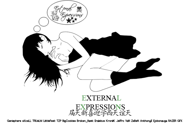
should really stick with simple text /blend/opacity until you get really good with text in the first sig i feel the colors you picked are to close to your render's skin color and doesn't bring out enough depth for me could use some darken to it as well too much lighting but it's alright you'll learn as you go i like your second one alot more but again need one inital light point and some darker areas keep it up bro.


 Reply With Quote