0 members and 5,340 guests
No Members online

» Site Navigation

» Stats
Members: 35,442
Threads: 103,075
Posts: 826,688
Top Poster: cc.RadillacVIII (7,429)
|
-
-

don't dream your live, live your dreams.
-
I enjoy the background work and effects
He does seem a little over-sharpend as do the effects on his arms, mainly his left arm, maybe just a simple colored c4d effect or bubble instead of a white one?)
also the light source, is confusing me, the light on the render is coming from the top left and your light is on the bottom (I do like your smudge work on it/around it)
-
that's great after 1 year.
could do with more effects and it looks a bit low quality  . .
sick stuff though e_e.
-
The sig looks a bit over-sharpened and work on the text a little bit more.
-
Nice! I love the yellow coloring and effect, did you use smudge tool or something else? I would love to know because I suck at those types of effects. Good job all in all! Keep it up, I like the effects on his right arm but maybe make his hand a little more defined? Also, it feels like it's missing just a tiny bit as far as the background goes but that's just me and my taste. Thank you so much for sharing. Keep it up!!
-
Hiya Ky an welcome back after a year break 
Couple things,
The colours are great and you did a good job showing "Action", good placement of your text as well.
I would suggest makign your tag bigger for starters, these days tags are kinda in the 400x250 ish
Second as stated i feel this image is too sharpened, and in some places thats great, like the face an chest, but the arms and shoulders could be blended in a little more.
Your effects are limited, but thats not always a bad thing, everything these days seems to be c4ded to the max ( guilty as charged sitting right here) But the effects you do have don't feel blended in ehough to give them "Reason" to be there, if this makes any sense, my adive to you is bring some of your effects a little closer to your render, or over lapping just slight, or put them on the boarders but pushing the eye view still towards your focal.
lol bla bla bla here I go.
One more thing, your text is fitting and your colorus for them as well fit perfect, my only suggestion to you is your name is kinda small ( once you inlarge your tags, this won't be too much of a problem)
GL an welcome back to the game, me lad 
 Radi's one of a kind gift <3
 ^My Wish List^

Similar Threads
-
By MinorThreat in forum Introductions
Replies: 14
Last Post: 08-12-2007, 04:05 PM
-
By Teh1337clown in forum Sigs & Manips
Replies: 3
Last Post: 07-14-2007, 06:29 PM
-
By Toshiyan in forum Sigs & Manips
Replies: 16
Last Post: 07-12-2007, 12:39 AM
-
By Nightfire in forum Sigs & Manips
Replies: 3
Last Post: 07-11-2007, 04:41 PM
-
By *Peng* in forum Digital Art
Replies: 5
Last Post: 01-07-2006, 05:32 PM
 Posting Permissions
- You may not post new threads
- You may not post replies
- You may not post attachments
- You may not edit your posts
-
Forum Rules
|


 Reply With Quote
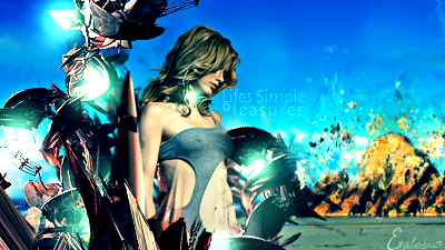


![[Radeon]'s Avatar](image.php?u=29894&dateline=1294012895)


