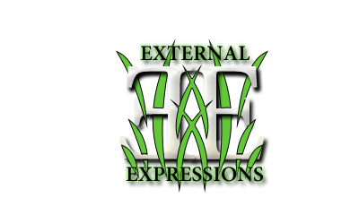
Yeah it needs some depth to it. The blending is harsh, which can be good but it feels rather one dimensional. Maybe add a little c4d work or some burn/dodge, and I would touch up the transition between the color areas with a scatter brush and opacity with shape dynamics as well.
Also needs some shadow work. It's a bit simple but it's not a bad start.
The hammer font is good but the Project font needs a lot of work IMO.
Don't really know what else to say since its so simple right now, keep it up!


 Reply With Quote