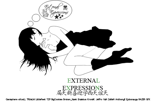
i really like this piece to me the way you captured the effects and light it looks as if you painted it some will say that you have to much lighting but for me personally it fits into the concept of this piece and end effects the enviroment around it i don't think the clipping on the font is necessary and a little distracting i would remove that pick a finer font and put the opacity to about 70-80 keep it up really enjoying your larger artworks.


 Reply With Quote