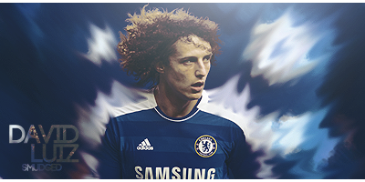
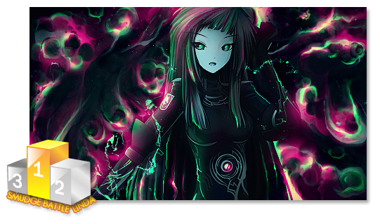
I haven't seen two opposite colors executed so well within a piece in a long time. Great job!
But that text, ew. That's ruining it.
Everything else is great. But that text really needs to go, or at least be moved, the placement is really distracting.


 Reply With Quote

 looks pretty epic


