GFXVoid Graphic Design Forum

Remove Text Formatting
Loading...

» Online Users: 9,368

0 members and 9,368 guests
No Members online

» Site Navigation

 > FAQ

» Stats

Members: 35,442
Threads: 103,075
Posts: 826,688
Top Poster: cc.RadillacVIII (7,429)
Welcome to our newest member, Lekelindids
Page 454 of 496 FirstFirst ... 354404444452453454455456464 ... LastLast
Results 4,531 to 4,540 of 4959
  1. #4531
    Join Date
    Sep 2009
    Location
    Candy Mountain
    Posts
    832

    Default

    haha havent changed my sig in fereverrrzz so this should be fun
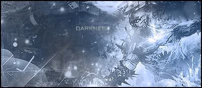
    uhm first sig: 7/10 - texture looks like his skin is gonna fall off, text... not great...
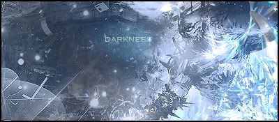
    2nd: same with the text but 8/10
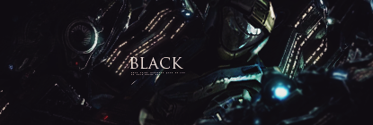
    3rd: too much yellow D;

    overall style: 9/10

    yeyyy

  2. #4532
    Join Date
    May 2008
    Location
    Michigan
    Posts
    1,227

    Default

    3/10.

  3. #4533
    Join Date
    Mar 2011
    Location
    TN
    Posts
    232

    Default

    7/10
    It's okay

  4. #4534
    Join Date
    Jun 2010
    Posts
    263

    Default

    7/10 and 8/10

  5. #4535
    Join Date
    Dec 2010
    Posts
    971

  6. #4536
    Join Date
    Mar 2011
    Posts
    31

    Default

    Logo: 7/10
    Sorry for my bad english
    newest:
    versie 1:


    versie 2:

  7. #4537
    Join Date
    Jun 2010
    Location
    netherlands
    Posts
    861

  8. #4538
    Join Date
    Apr 2011
    Posts
    153

    Default

    8/10 i like the effects alot needs a little work on depth


    thanks STRID3R 9YO

  9. #4539
    Join Date
    Dec 2009
    Location
    Netherlands
    Posts
    1,412

    Default

    Quote Originally Posted by Cap'n Jazz View Post
    3/10.
    Dude? 3/10 for a handdrawn signature? ah well to each their own opinion.

    On topic: I find it a bit difficult to recognise what the focal is supposed to be, the dark spots are too dark and the light spots too light. However there's a good sense of flow. Keep it up 5/10.

  10. #4540
    Join Date
    Dec 2010
    Location
    The Netherlands
    Posts
    317

    Default

    Its nice but Its not my style meh.. 7/10


Similar Threads

  1. Rate The Sig Above!
    By SgtSwabs in forum The Void
    Replies: 16
    Last Post: 12-06-2005, 08:42 PM
  2. *NEW* Rate Avatar? Rate Sig?
    By LunarPoet in forum Sigs & Manips
    Replies: 1
    Last Post: 06-23-2005, 12:31 PM
  3. Rate my Signature...
    By Xavier in forum Sigs & Manips
    Replies: 8
    Last Post: 06-03-2005, 01:46 AM

Posting Permissions

  • You may not post new threads
  • You may not post replies
  • You may not post attachments
  • You may not edit your posts
  •  
Powered by vBadvanced CMPS v4.1.1