GFXVoid Graphic Design Forum

Remove Text Formatting
Loading...

» Online Users: 26,370

0 members and 26,370 guests
No Members online

» Site Navigation

 > FAQ

» Stats

Members: 35,442
Threads: 103,075
Posts: 826,688
Top Poster: cc.RadillacVIII (7,429)
Welcome to our newest member, Lekelindids
Page 456 of 496 FirstFirst ... 356406446454455456457458466 ... LastLast
Results 4,551 to 4,560 of 4959
  1. #4551
    Join Date
    Apr 2011
    Location
    South London
    Posts
    86

    Default

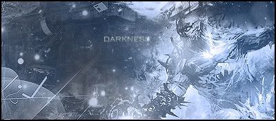
    8/10. Lightings good, don't like the blue lines though.

  2. #4552
    Join Date
    Sep 2009
    Location
    Candy Mountain
    Posts
    832

    Default

    uhm... well deviantart is blocked at boarding school.
    and i dont feel like clicking the other link
    so
    0/10

    you fail at life. bitch.

    <3 jk i love you

    (there's a chance i just cant see the picture because of the filter the school has up so i'm sorry )

  3. #4553
    Join Date
    Apr 2011
    Location
    South London
    Posts
    86

    Default

    Haha, the other link has it on the last page.

    Left: I'm assuming its a vector you made, ermm 7/10, know nothing about vectors so no C&C
    Right: I like the blending, text is a bit unreadable. 8/10

  4. #4554
    Join Date
    Sep 2009
    Location
    Candy Mountain
    Posts
    832

    Default

    mmm no not a vector. pen tooled with a tablet.
    text says sometimes the dark is more comforting than the light.

    sonic is bitchin, but its a little bland in the bg. 7.6/10

  5. #4555
    Join Date
    Feb 2008
    Location
    Toronto, Canada
    Posts
    4,831

    Default

    Gonna rate the right one here. I'ma give it a 6.8/10 interesting. LIke the placement, but can't read the text.


  6. #4556
    Join Date
    Jan 2009
    Location
    Scotland
    Posts
    2,772

    Default

    6.5/10 compo could be a lot better, as well as text.. nice to see you again btw immo

  7. #4557
    Join Date
    Mar 2011
    Posts
    31

    Default

    8/10 if you drawed it by yourself ???
    Sorry for my bad english
    newest:
    versie 1:


    versie 2:

  8. #4558
    Join Date
    Sep 2009
    Location
    Candy Mountain
    Posts
    832

    Default

    hmmm would be more interesting with color, especially with the way the lighting is done
    6.7/10.0

  9. #4559
    Join Date
    Mar 2011
    Location
    TN
    Posts
    232

    Default

    7/10
    It's nice

  10. #4560
    Join Date
    Feb 2011
    Posts
    492

Similar Threads

  1. Rate The Sig Above!
    By SgtSwabs in forum The Void
    Replies: 16
    Last Post: 12-06-2005, 08:42 PM
  2. *NEW* Rate Avatar? Rate Sig?
    By LunarPoet in forum Sigs & Manips
    Replies: 1
    Last Post: 06-23-2005, 12:31 PM
  3. Rate my Signature...
    By Xavier in forum Sigs & Manips
    Replies: 8
    Last Post: 06-03-2005, 01:46 AM

Posting Permissions

  • You may not post new threads
  • You may not post replies
  • You may not post attachments
  • You may not edit your posts
  •  
Powered by vBadvanced CMPS v4.1.1