0 members and 969 guests
No Members online

» Site Navigation

» Stats
Members: 35,442
Threads: 103,075
Posts: 826,688
Top Poster: cc.RadillacVIII (7,429)
|
-
04-30-2011, 05:27 PM
#4631

8/10 For first. I like it except for the text.
6/10 For second. Not really a fan, sorry.
-
04-30-2011, 10:55 PM
#4632
really nice flow, text is awsome but light is bit too strong IMO 7/10
Favorite and Most Recent  :

-
04-30-2011, 11:03 PM
#4633
7/10
too much sharpened
add more depth and improve the lighting a bit
 ^thanks for the epic gift AGITATOR!
-
05-01-2011, 12:31 AM
#4634
1st one: 8.5/10
2nd one: 9.5/10
-
05-01-2011, 12:50 AM
#4635
^thanks for the epic gift AGITATOR!
-
05-01-2011, 12:54 AM
#4636
-
05-01-2011, 04:21 AM
#4637
6
I don't like it,
i think it's to 'overblurred' in the BG and i don't like the lightening..
Sorry for my bad english
newest:
versie 1:
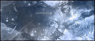
versie 2:
-
05-01-2011, 04:28 AM
#4638

Wrftw thanks for the awesome gift
-
05-01-2011, 04:37 PM
#4639
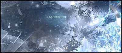
Sorry for my bad english
newest:
versie 1:
versie 2:
-
05-01-2011, 05:48 PM
#4640
Similar Threads
-
By SgtSwabs in forum The Void
Replies: 16
Last Post: 12-06-2005, 08:42 PM
-
By LunarPoet in forum Sigs & Manips
Replies: 1
Last Post: 06-23-2005, 12:31 PM
-
By Xavier in forum Sigs & Manips
Replies: 8
Last Post: 06-03-2005, 01:46 AM
 Posting Permissions
- You may not post new threads
- You may not post replies
- You may not post attachments
- You may not edit your posts
-
Forum Rules
|


 Reply With Quote