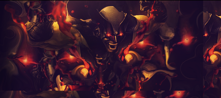
I like it. But it just needs some more. I see you've placed a c4d at the bottom of the sig, I have to agree with slayer that it doesn't really fit atm. Maybe you can add some more of them to make it fit more. The colors are great imo, just try to do some more with the lightning. This render fits the best in a dark atmosphere so maybe you can burn some more, make a good lightning source and such.
Overall pretty good job. Keep it up


 Reply With Quote