


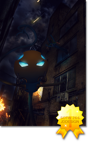
I like the depth. I would fill in that background grey area with something though..seems kinda bland. And the colors are a little dull to me as well. The text actually looks nice with this sig.
|
|


Loading...
|
» Online Users: 735
|
Results 1 to 5 of 5
Thread: kid cudi c/cThreaded View
Similar Threads
|


 Reply With Quote