0 members and 4,699 guests
No Members online

» Site Navigation

» Stats
Members: 35,442
Threads: 103,075
Posts: 826,688
Top Poster: cc.RadillacVIII (7,429)
|
-
-

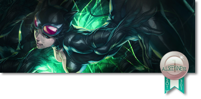
move the alien to the left slightly. he's too far on one side also add something to the left side, its too empty there. Im not digging that at all.. colouring is alright, bit monotone though, depth is so so, It needs more to it. It looks very un finished
-
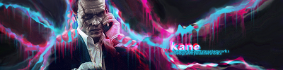
I have always preferred a coloured tag against a B/W one
So i'll go with the V1/colored version here....
Now,on the tag
your tag has a really nice blending and color feel but there are certain things that you might work on,Loose the text doesn't really fit in there plus the black borders are blocking your flow,so might wanna lose them as well
Lighting needs work,the focal head is pretty much brighters than the overall light in ur tag
so burn the sides,reduce the light over the focal and dodge certain areas on the background
The tag also needs vibrance and some depth,sharpen ur focal abit
Lastly,work over the compo. render needs some better position....
Overall its a great piece of art,KIU mate
-
CnC
Well first of all i would say that remove the text from the tag. Its not at all helping the tag. Now comes the tag. Yeah they need some tweeks to make it more good. First of all i will say about the color. Tag color atm seems to washout .Add more vibrance to them. To improve it i would suggest you to add one more color to the tag. Detail in the tag is also somewhat low. You can add star stocks at color dodge to get some nice small dots or add some space stocks to screen or lighten. To fill up the left side add some splatter brushes and clip mask them. Here i have a tutorial for you which will help you out.
http://i9.lulzimg.com/i/3b824162.png
If you have any problem feel free to ask me. KIU mate.
-
I am currently feeling the black and white version because the saturation in the colored version goes up and down from the left to right and therefore throws it off.
It seems okay as of now but what I believe you should have done is kept the lowly saturated thing you had going on, on the left and continued it. Try to make your FX pop out more because at the moment they only consist of one tone, mainly magenta and therefore it seems a bit flat. I would also try to add some blue to this because it is a bit monotone which I don't believe suits this.
Try to focus on your lighting more as well because it seems to be a bit iffy here.
Lighting really helps with the overall appeal of this signature.
This could just use better effects, adjustments and more discrete lighting to push it up.
Kiu, you're improving .
Similar Threads
-
By Xelo in forum Digital Art
Replies: 1
Last Post: 01-22-2011, 05:47 PM
-
By Jay X in forum Sigs & Manips
Replies: 21
Last Post: 08-06-2010, 12:34 PM
-
By krypto in forum Sigs & Manips
Replies: 3
Last Post: 03-20-2008, 06:48 AM
-
By Firefly2347 in forum Digital Art
Replies: 1
Last Post: 10-21-2005, 02:28 PM
-
By Virus in forum Digital Art
Replies: 7
Last Post: 10-07-2005, 04:41 PM
 Posting Permissions
- You may not post new threads
- You may not post replies
- You may not post attachments
- You may not edit your posts
-
Forum Rules
|


 Reply With Quote