0 members and 18,314 guests
No Members online

» Site Navigation

» Stats
Members: 35,442
Threads: 103,075
Posts: 826,688
Top Poster: cc.RadillacVIII (7,429)
|
-
 Gun Guy, Koko, and Flying Devil Girl Gun Guy, Koko, and Flying Devil Girl
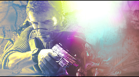  <Trying to learn how to use textures. <Trying to learn how to use textures.
 v2 v2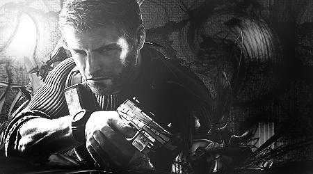
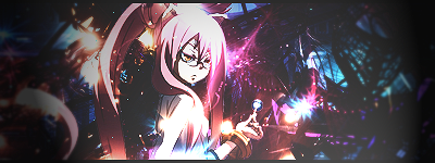
CNC please, mainly the first one.
Last edited by cC.ZaMa; 06-21-2011 at 08:39 PM.
-
well for textures u dont want them to be the focal, thats the first thing u should know.
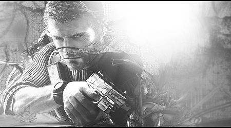
that texture goin over the guy's face kills it tbh, its like having 2 focals, u dont know wheter u want to find the guy's face or look at the texture. its also too bright for a texture tag IN MY OPINION, that might be only me tho. but when i make a tag with textures i try to go with a dark feel that will compliment the atmosphere of the textures i use. the lightning in this tag is too strong, it distracts from the focal and it doesnt really compliment the render's lightning because u can see the face/arm of the render is bright by the left, yet theres a huge bright spot at the right. i would totally remove the borders from this tag, they distract a lot. remember to play a lot with the blending modes of ur textures, and make sure the textures u use are high quality, otherwise they r gonna get pixelated and ruin ur tag with a sharpen filter. the black and white version is better i guess, since theres no harmony with the colors u picked for the first one, the coloring looks pretty random to me. i hope i wasnt too hars or something, its not too bad for ur first time with textures, just keep at it 
i will let someone else do the other 2 tags lol
enzo <3


-
Thanks for the CNC bro, it really helped! 
-
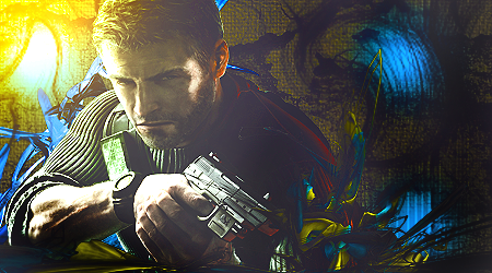
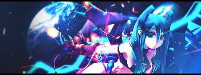
Aight, i will cnc your other 2 tags:
I realy like what you did with the first one of the 2 small tags, the offset fits nice in there
And it has some good depth
But next time dont try to place your render in the middle of the tag, its kinda boring tot look at, Also the contrast on the lichtning effects seems very high. try to keep it down next time
The seccond one looks a bit random to me, the feects dont go with her flow, and fore example the planet looks on oone part very lq and on the otherpart blurry...
There are also no dark spots in there...
And on the first tag, try not to make it to sharp, it makes the tag a bit lq
keep at it man, i like the switch of your styles
-
render looks distorted IMO on the 1st to 4th
1st anime tag looks overexposed but i like the bg there
2nd anime tag looks oversharpened and overlighted but i love the color scheme
 ^thanks for the epic gift AGITATOR!
-
Ah, I wasn't really aiming to put it in the middle, I guess I should have moved it a bit more to the left xD. And ahh, I wasn't careful with my blurring and sharpening one the planet one either >.<. And erm Edwin, idk..I held down shift and resized using that so it shouldn't be distorted..Thanks for the great cnc guys, I'll keep these in mind .
Similar Threads
-
By sirenzo in forum Sigs & Manips
Replies: 6
Last Post: 12-24-2010, 01:51 PM
-
By sirenzo in forum Sigs & Manips
Replies: 7
Last Post: 12-24-2010, 11:49 AM
-
By Ultima in forum Sigs & Manips
Replies: 0
Last Post: 06-15-2008, 12:47 PM
-
By Virulent in forum Digital Art
Replies: 4
Last Post: 02-23-2006, 01:48 PM
 Posting Permissions
- You may not post new threads
- You may not post replies
- You may not post attachments
- You may not edit your posts
-
Forum Rules
|


 Reply With Quote


