0 members and 18,805 guests
No Members online

» Site Navigation

» Stats
Members: 35,442
Threads: 103,075
Posts: 826,688
Top Poster: cc.RadillacVIII (7,429)
|
-
 Grimmjow. Grimmjow.
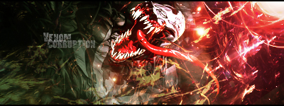
Just playing with fractuals. First time I've really used them in a sig. There's a lot going on in it, I know.
Specifically, is lighting okay? And how is the text? I know its plain, and I normally don't put text but I figured I may as well try. Didn't really bother blending it, so it sticks out quite a bit.
v1.

v2.

Edit: Maybe just CNC everything. ;] Might as well learn as much as I can.
Last edited by Lancenat; 08-13-2011 at 11:08 AM.
-
-
i like the first one more, its not over blured then the 2nd one.
i think u get the idea of depth, and the light is also really good ;]
only thing i would change, is more hq effects, like c4d .. more shining stuff, to create Flow , like u have on his hand!
The text isnt bad but the placment isnt the best, but text is a hard part of sigs, and with time u will get it right ;] place it closer to ur focal [ render ] and it should do the work!
Keep it up bud!
-
Thanks for the feedback Linda, I was really focusing on lighting and trying out the flow with this one. I really appreciate it. I'll definitely focus on more effects. :]
-
Flow is good. depth is good.. lighting is alright.. coloring is off..
More powerful effect and itd look good.
-
First version looks good to me but the colors seem a bit burned, maybe too contrasted. Otherwise Keep it up man
-
-
Thanks for all the feedback. I'd definitely try fixing them! :]
-
First one is solid. No glaring problems IMO.
My favorite work of mine:
 SOTW stats: Entries: 2 Wins: 0 Second place: 0 Top 3: 0 Top 5: 1
 Posting Permissions
- You may not post new threads
- You may not post replies
- You may not post attachments
- You may not edit your posts
-
Forum Rules
|


 Reply With Quote