GFXVoid Graphic Design Forum

Remove Text Formatting
Loading...

» Online Users: 12,835

0 members and 12,835 guests
No Members online

» Site Navigation

 > FAQ

» Stats

Members: 35,442
Threads: 103,075
Posts: 826,688
Top Poster: cc.RadillacVIII (7,429)
Welcome to our newest member, Lekelindids
Page 1 of 2 12 LastLast
Results 1 to 10 of 12
  1. #1

    Default new sig. followed a tut but tweaked it to my liking.

    I did do this from a tutorial, but I tweaked almost all of the steps to my liking to go better with the render I chose, and the background.


    Dark Method: fluff guy...weird name guy...ur all fucking weird and that's all i have to say about that

  2. #2

    Default

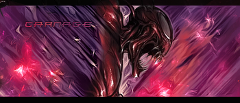
    Nice outcome...on one of my tutorials ....oh and just gotta work a little bit more in the blending :P
    Proud Owner of:
    RichFlyers
    Skype: NovruzeliHuseynov


    ^ LOVE YOU RAD ^


  3. #3
    Join Date
    Mar 2011
    Posts
    192

    Default

    Need to work on your text m8 and agree work on your blending!


  4. #4
    Join Date
    Aug 2010
    Location
    Im Problly In The Sky Swimming With The Fishes
    Posts
    155

    Default

    I agree also text placements need work but don't feel bad i suck at that also


  5. #5

    Default

    Thanks alot for the feedback guys, and yes it was your tut kroniik :P and I just noticed we are all void knights here :P


    Dark Method: fluff guy...weird name guy...ur all fucking weird and that's all i have to say about that

  6. #6

    Default

    well we got each-others back at-least ...ahahaha XD...though like I said again...work on the blending more man :P....
    Proud Owner of:
    RichFlyers
    Skype: NovruzeliHuseynov


    ^ LOVE YOU RAD ^


  7. #7

    Default

    yea. I have no idea what that is :P


    Dark Method: fluff guy...weird name guy...ur all fucking weird and that's all i have to say about that

  8. #8
    Join Date
    Jul 2008
    Location
    Leominster, Massachusettes
    Posts
    2,293

    Default

    Blending, depth, lighting, flow, composition, text, basically every main component to a tag needs to be worked on here, the render looks stretched the background doesn't really fit either I suggest reading more tutorials. The background and render don't really go well.

  9. #9

    Default

    stfu fork. ur high.
    Last edited by The Fluffy Goat; 08-30-2011 at 02:08 AM.


    Dark Method: fluff guy...weird name guy...ur all fucking weird and that's all i have to say about that

  10. #10
    Join Date
    Jul 2008
    Location
    Leominster, Massachusettes
    Posts
    2,293

    Default

    No, I'm just CnCing your piece. That is all, you can take it or leave it, doesn't really matter to me nor does it hurt me.

Similar Threads

  1. Dog Tag (tweaked)
    By Virulent in forum Sigs & Manips
    Replies: 3
    Last Post: 04-18-2006, 07:34 AM
  2. NEWEST SIG , i'm really liking this one
    By DragonsRage in forum Sigs & Manips
    Replies: 13
    Last Post: 05-23-2005, 03:40 AM

Posting Permissions

  • You may not post new threads
  • You may not post replies
  • You may not post attachments
  • You may not edit your posts
  •  
Powered by vBadvanced CMPS v4.1.1