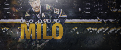
Colored version IMO.
I like the text, it really works here. However, I think you should move it left ~30 pixels and crop off some of the right. The lighting next to the render is also too strong and takes the eye away from it. The sig looked washed out but it works well here. Nice job.


 Reply With Quote