My funky old tut hehe http://www.gfxvoid.com/forums/showth...ature-Tutorial
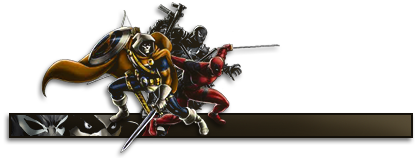
The angle and flow is great. The dots in the background creates a good depth. I really like the clip mask rectangle but it would look so much better if it were closer to Travie, like it's popping out behind him. Text could be improved by keeping the two words closer to each other. The overall colors of the tag could be more vibrant, seems a bit washed out atm.
Last but not least you overused topaz clean, lower the opacity a bit.
Fresh shit yo!


 Reply With Quote