0 members and 1,102 guests
No Members online

» Site Navigation

» Stats
Members: 35,442
Threads: 103,075
Posts: 826,688
Top Poster: cc.RadillacVIII (7,429)
|
-
 Gears of war Gears of war
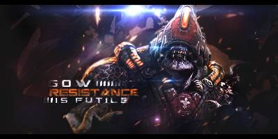
CNC please
-
anything GoW is badass :P.....though I suggest getting rid of borders...and thet flaer at the top :P and a tiny work on your text would do.
Skype: NovruzeliHuseynov

^ LOVE YOU RAD ^
-
-
All of the flares aren't working very well here, try using a different source for light.
#Elephants Never Forget, So My Dick Remembers Everything
First Come First Serve Gift From Distelo<3

-
actually in my taste the flare is kinda good...just kill the borders and add details
 ^thanks for the epic gift AGITATOR!
-
Same, the flare didn't look bad in my opinion, the borders need to go though!
-
 Originally Posted by +s9.KroniiK

anything GoW is badass :P.....though I suggest getting rid of borders...and thet flaer at the top :P and a tiny work on your text would do.
Yeah borders are bad. It looked dull without the flare any suggestion to how I could actually have a good light source instead of the flare ? And what work on the text would you suggest because I suck at text, so any tips will help. Thankyou for the comment
Originally Posted by .Void
Kill the border.
Indeed it does look bad. Thank you for your comment
Originally Posted by Pred™
All of the flares aren't working very well here, try using a different source for light.
Okay, what kind of light source could I use ? Thanks for the comment
Originally Posted by edwinpabito
actually in my taste the flare is kinda good...just kill the borders and add details
Yep I like them too, but open to suggestions to take them out. And yeah border is bad. Thanks for the comment
Originally Posted by Xiu
Same, the flare didn't look bad in my opinion, the borders need to go though!
I also like the flares  and yeah border doesn't fit thanks for the comment and yeah border doesn't fit thanks for the comment
Sorry for the late replies
-
i like the boarders in this one but i think all the effects look blured or lq imo and the text works on this one and that lens flare on the top needs to go also lol
-
Originally Posted by +s9.Oath
i like the boarders in this one but i think all the effects look blured or lq imo and the text works on this one and that lens flare on the top needs to go also lol
Lol don't know why they look lq, but I think it adds nice lighting .. I don't know how I could make a natural looking light source instead. Text is good ? Yay I suck with text.
Thanks for commenting.
-
Originally Posted by SuperNovas
Lol don't know why they look lq, but I think it adds nice lighting .. I don't know how I could make a natural looking light source instead. Text is good ? Yay I suck with text.
Thanks for commenting.
One idea for that is use a soft brush on either 100 px or 140 px. Set the color on light yellow (for example), a color that'll give your render a depth.
But makes sure you make the brushing on a new layer either on top of most other layers (and definitely under layer effects like Gradient Maps, etc). Set the light wherever you feels is best. Soft light, lower opacity is basically it.
For the text, just a slight size readjustment. Tweak with the font a bit. But other than these suggestions, I like it. Gears is pretty cool.
Similar Threads
-
By XDesign in forum Sigs & Manips
Replies: 2
Last Post: 07-02-2011, 04:34 PM
-
By Image in forum Sigs & Manips
Replies: 2
Last Post: 06-13-2011, 03:15 PM
-
By Cap'n Jazz in forum Sigs & Manips
Replies: 7
Last Post: 12-29-2010, 11:50 AM
-
By cs4pro in forum Sigs & Manips
Replies: 10
Last Post: 02-08-2010, 03:29 PM
 Posting Permissions
- You may not post new threads
- You may not post replies
- You may not post attachments
- You may not edit your posts
-
Forum Rules
|


 Reply With Quote