0 members and 16,754 guests
No Members online

» Site Navigation

» Stats
Members: 35,442
Threads: 103,075
Posts: 826,688
Top Poster: cc.RadillacVIII (7,429)
|
-
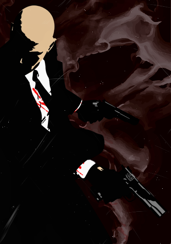
 Hitman-~-Absolution Hitman-~-Absolution
A vectorized version of the Hitman render that you may find in the S9 May Pack.
The background is also a vectorized ink stock.
Let me know what you guys think and which version you prefer?
-
Sex, sex, sex, sex, sex. Awesome! 
I'm actually digging the one on the left more, to be honest ^-^
Good job Radi, as always :3
-
Right version is dope 
Skype: NovruzeliHuseynov

^ LOVE YOU RAD ^
-
Love the style of what you did, seems like it has potential to do even better. KIU ^.^
-
Rad you are too awesome for your own good =p
I prefer v1.

One of the sexiest tags I've ever seen, from Radillac ↓ <3
-
Hehe thanks guys and glad to hear that you like it.
I prefer the atmo in the dark one but the light one shows more details of the agent, so I'm ambivalent.
GZ you may have this as a gift if you like
-
the version on the right is better imo
-
 Radi's one of a kind gift <3
 ^My Wish List^

-
Thanks Oath!
 Originally Posted by Slave

I'm impressed!
I'll take that as a compliment
-
The dark one on the left works better, because he's dark and it matches, but the other one is better detailed. so they're probably as good as eachother

^Great what I think is an abstract giftie from Distello^
Similar Threads
-
By cc.mio in forum Digital Art
Replies: 9
Last Post: 03-22-2012, 02:34 PM
-
By cc.mio in forum Sigs & Manips
Replies: 9
Last Post: 05-02-2010, 02:39 AM
-
By cc.mio in forum Sigs & Manips
Replies: 6
Last Post: 10-26-2008, 10:09 AM
-
By Reinkaos in forum Sigs & Manips
Replies: 3
Last Post: 07-31-2008, 10:06 AM
-
By BeaSt in forum Digital Art
Replies: 3
Last Post: 08-21-2007, 01:42 AM
 Posting Permissions
- You may not post new threads
- You may not post replies
- You may not post attachments
- You may not edit your posts
-
Forum Rules
|


 Reply With Quote